

Visualization designs for Terra Data Explorer experience
GENOMICS DATA EXPLORER
Client | Broad Institute of MIT and Harvard, Data Sciences Platform (DSP)
Responsibilities | User Research, UX Design, Visual Design, Visualization Design
Product Overview
The Broad Institute’s Terra platform allows users to access genomics data to conduct research, analysis, and secure collaboration in the cloud. A key challenge for Terra users is navigating and comparing the sheer amount of data available in the platform. As a design consultant for Broad’s Data Sciences Platform (DSP) team, I designed a series of accessible visualization tools as part of Terra’s upcoming “Data Explorer” experience.
Challenge
Currently in Terra, users cannot preview the datasets they are working with prior to creating and using a data snapshot. Instead, they manually download, unpack, and inspect the data to determine its relevance. Well designed visualizations across the search process would provide a more intuitive, complete, and efficient way to examine available datasets to help users find the data they need.
User Journey & Opportunities
I conducted five generative user interviews with computational biologists and PMs, the two key user groups identified during scoping, to generate an overall understanding of the “search across datasets” experience in Data Explorer. A user’s primary goal in this experience is to filter and create a research data subset from the large volume of open data available on Terra, sometimes pulling from multiple datasets on the platform.
User journey, highlighting key insights for each step of the iterative search and filter process
Key characteristics, such as distributions, quantiles, and dimensionality, are currently only accessed through downloading metadata and portions of the data tables themselves. Our research participants consistently wanted to able to preview their results without significant data downloading, as well as to tweak their data ranges, demographics, and other characteristics without needing to restart the search query process.
Therefore, key aspects of a visualization experience need to include:
A way to preview search results to understand data structure and content
Functionality to tweak results without re-running a search query
A way to compare data from multiple sources to speed up exploration
Content & Layout
From generative interviews and DSP stakeholder input, I designed a series of wireframes for a data preview experience comprised of pre-populated, customizable data tiles. When applying a search query, the experience needs to balance the information density, functionality desired by users, and what is possible to compare with the heterogenous data provided.
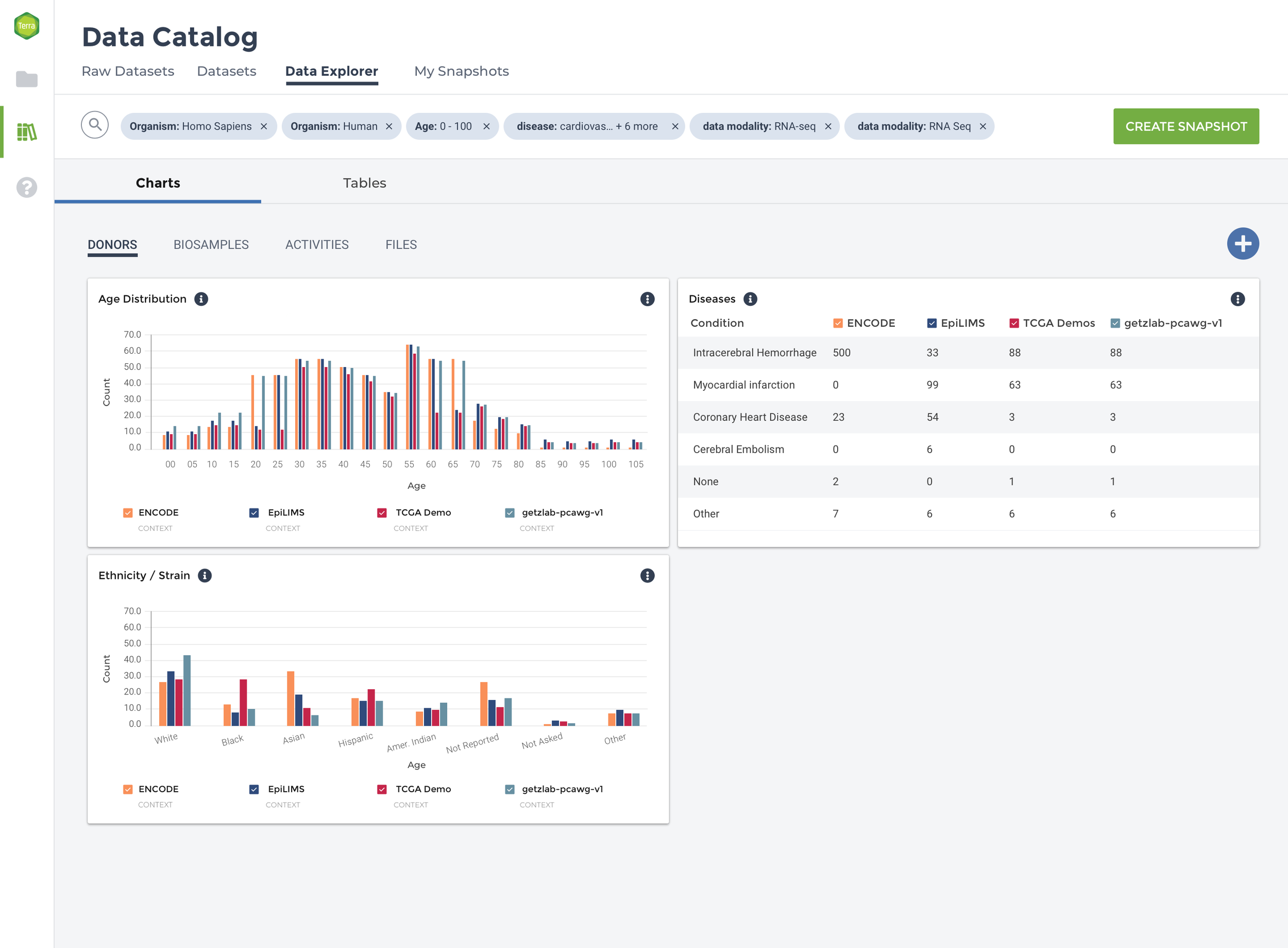
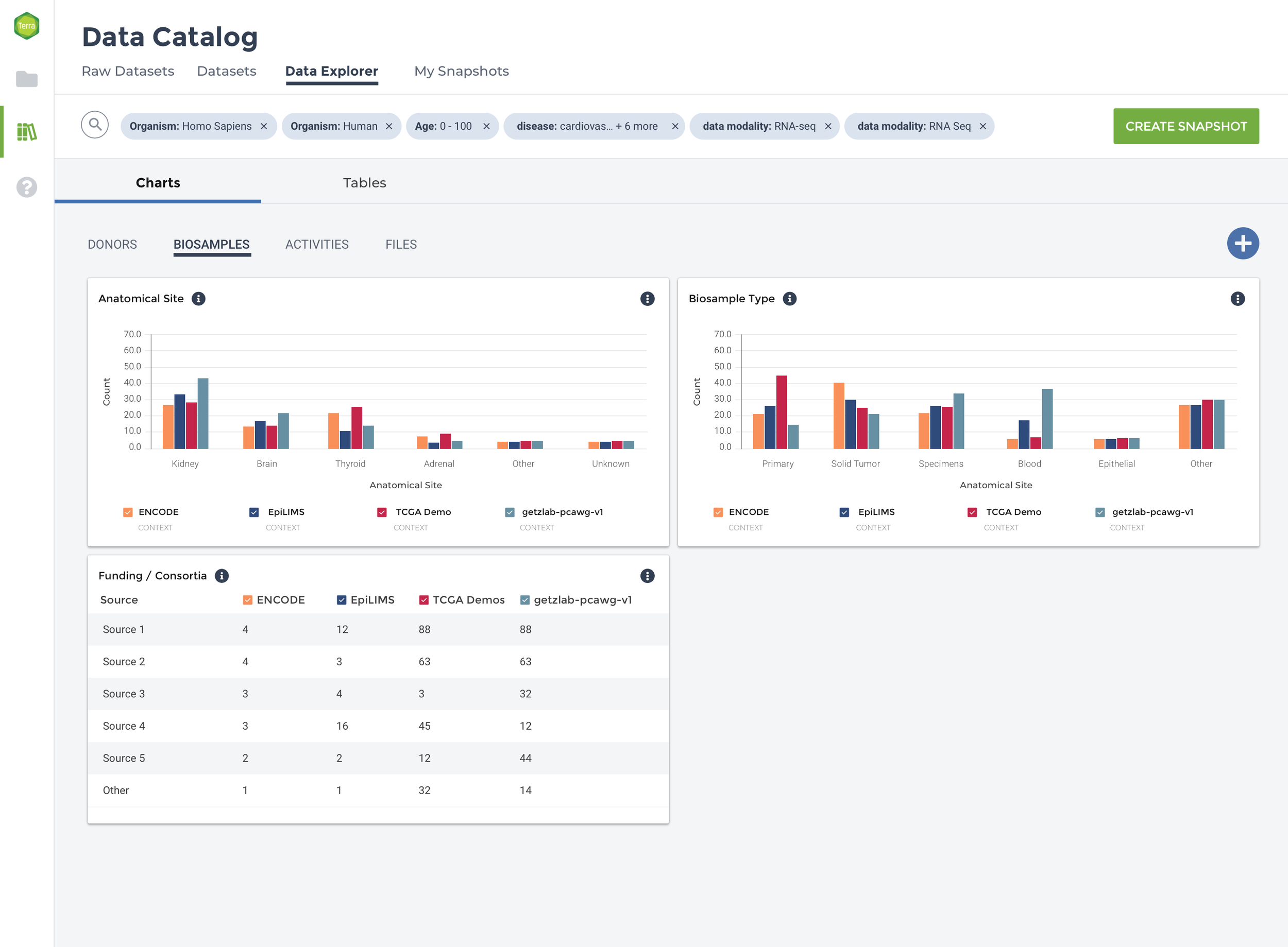
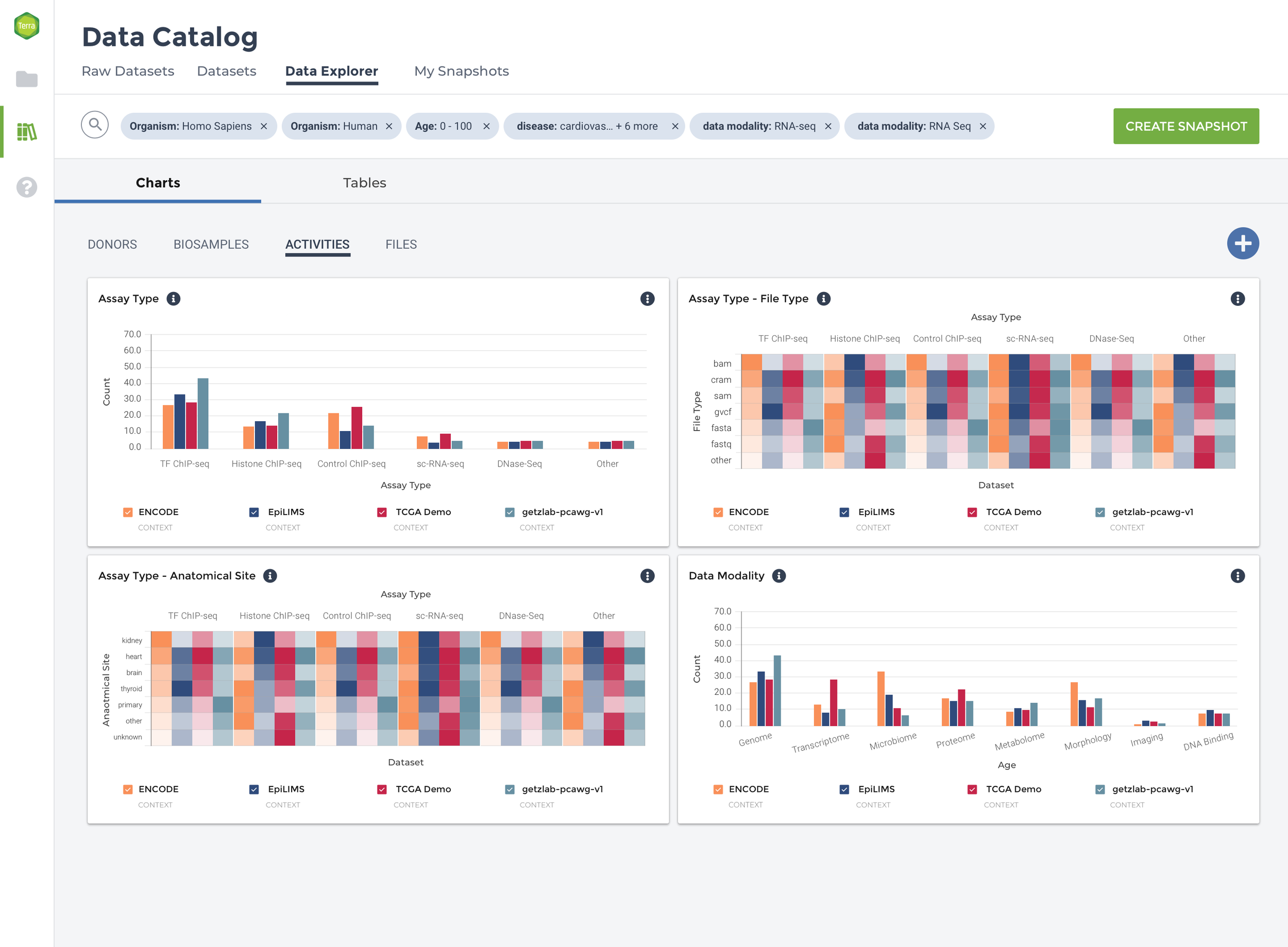
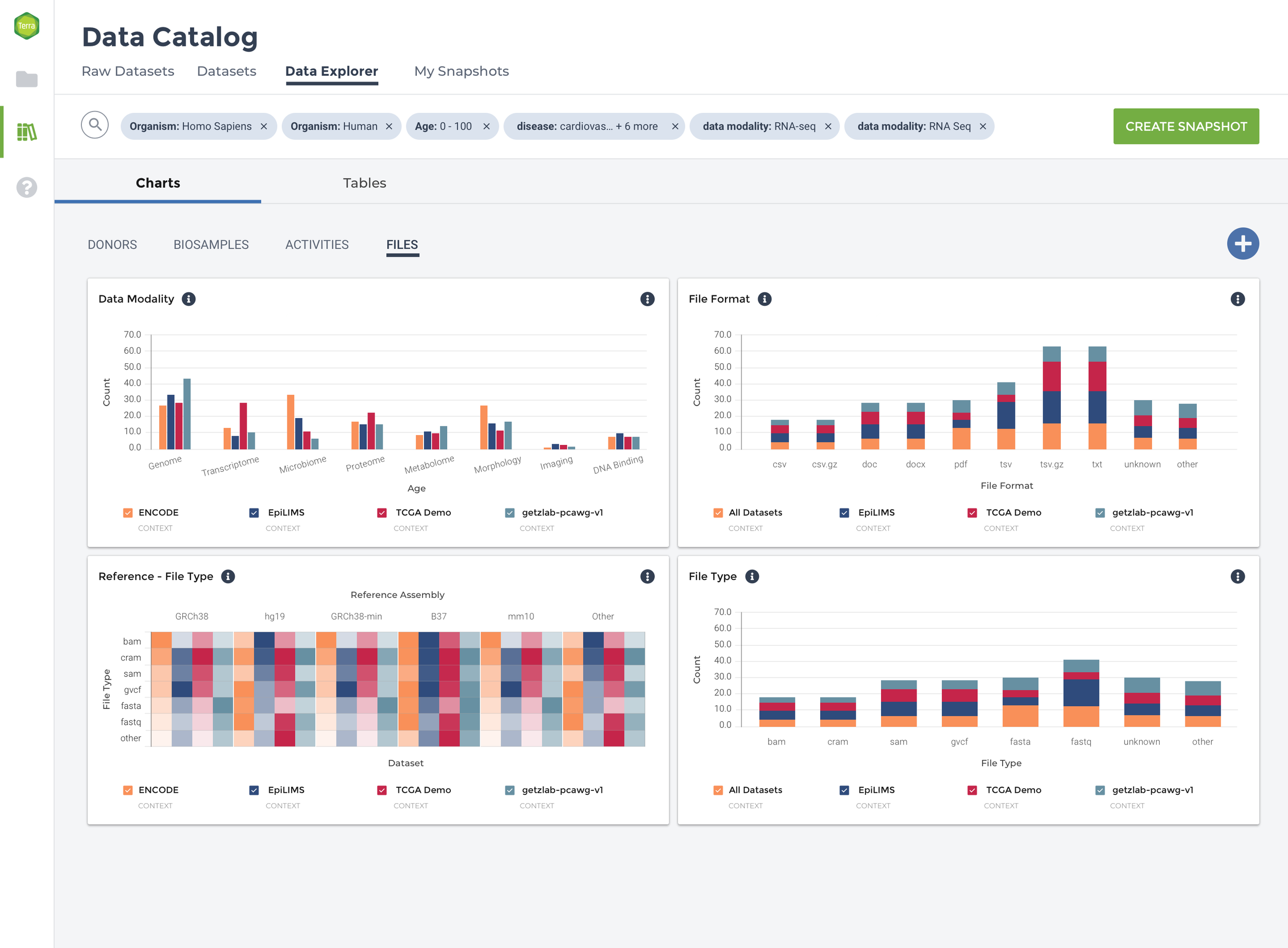
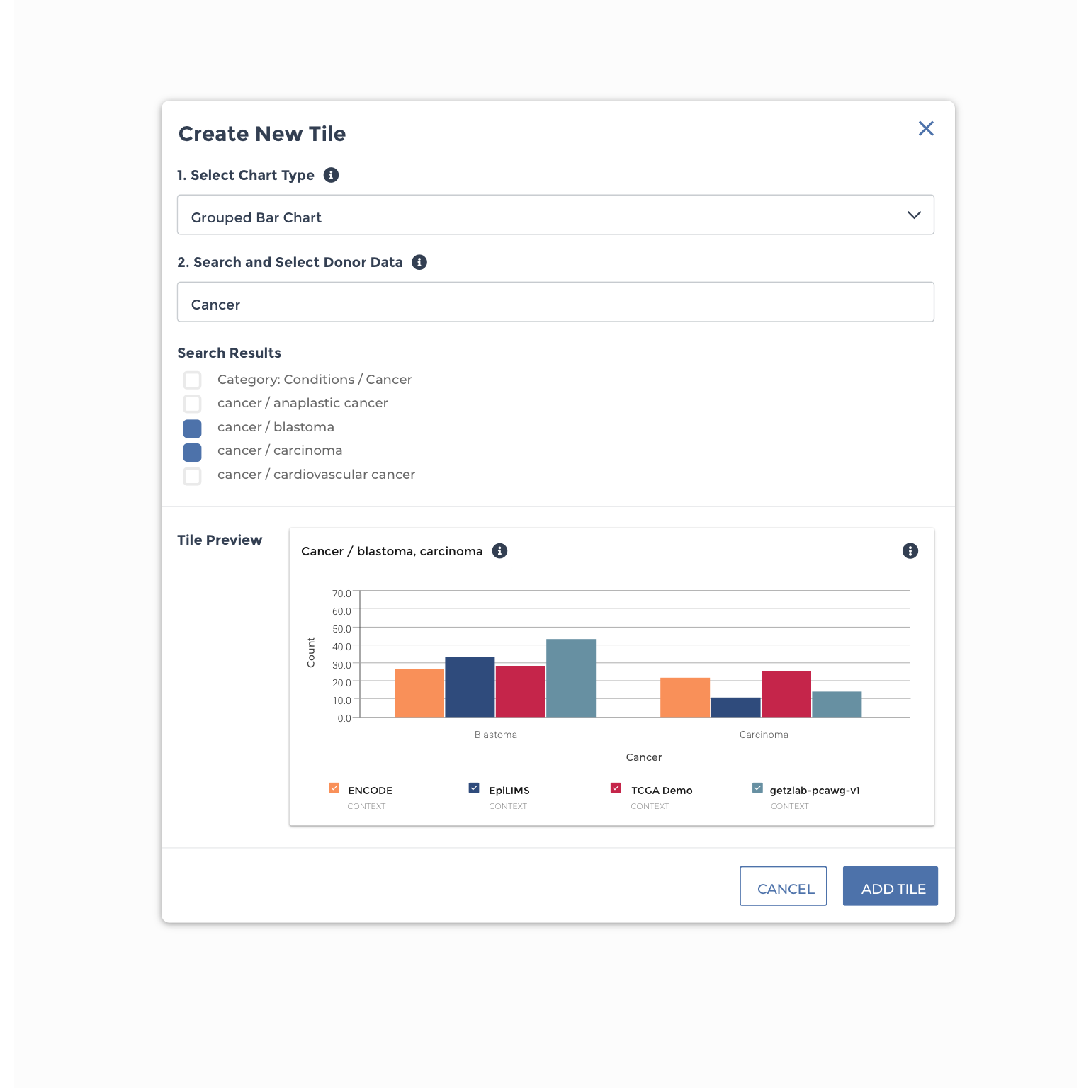
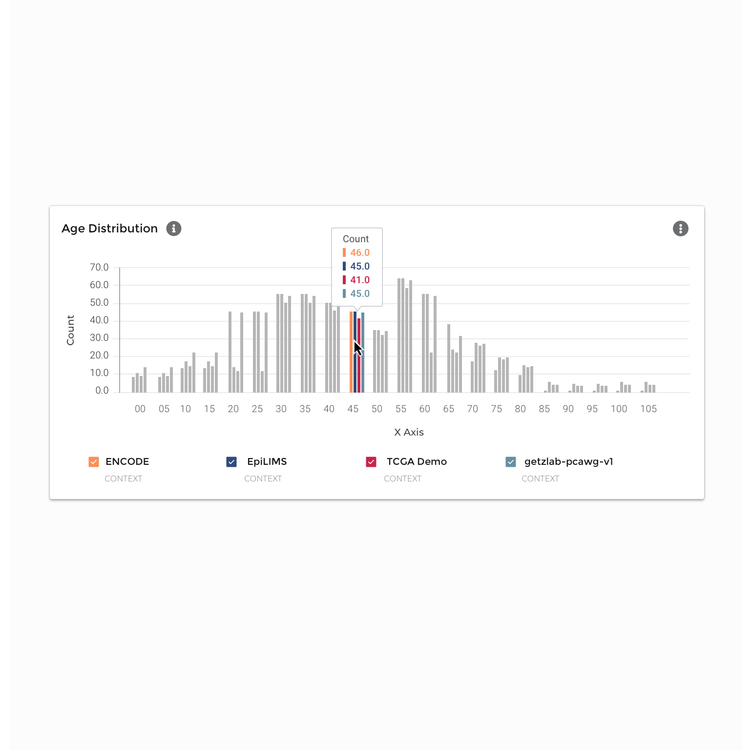
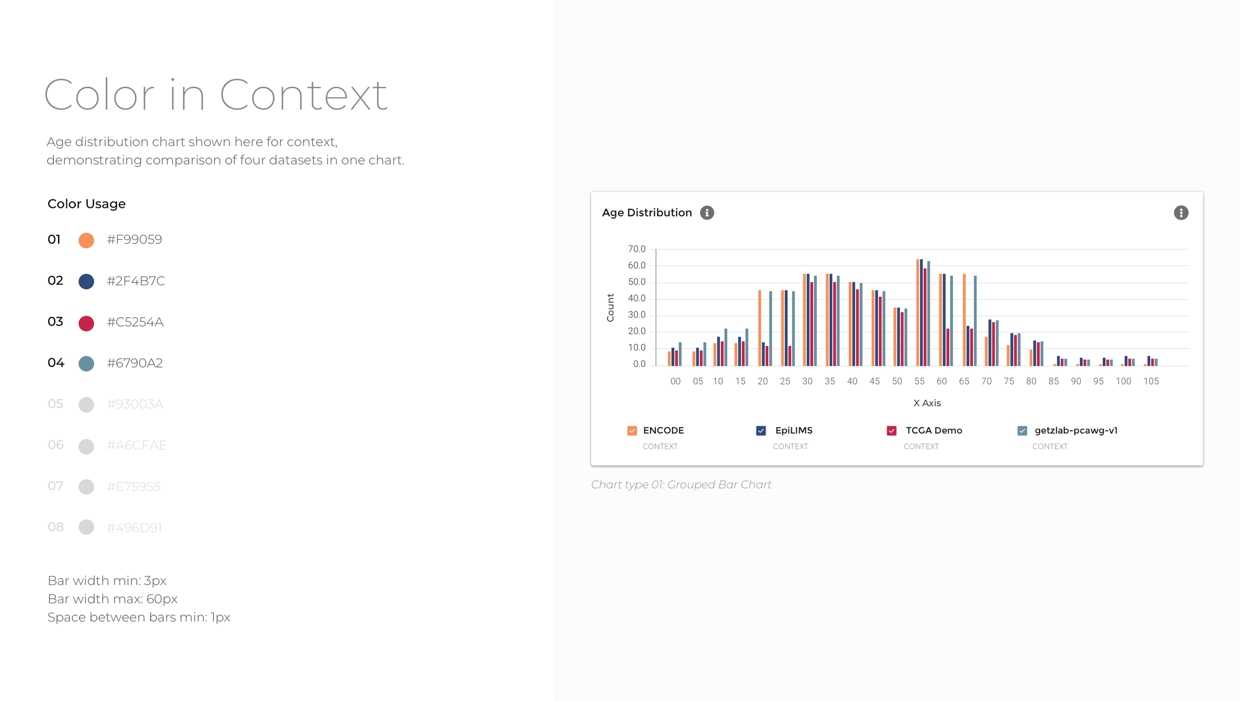
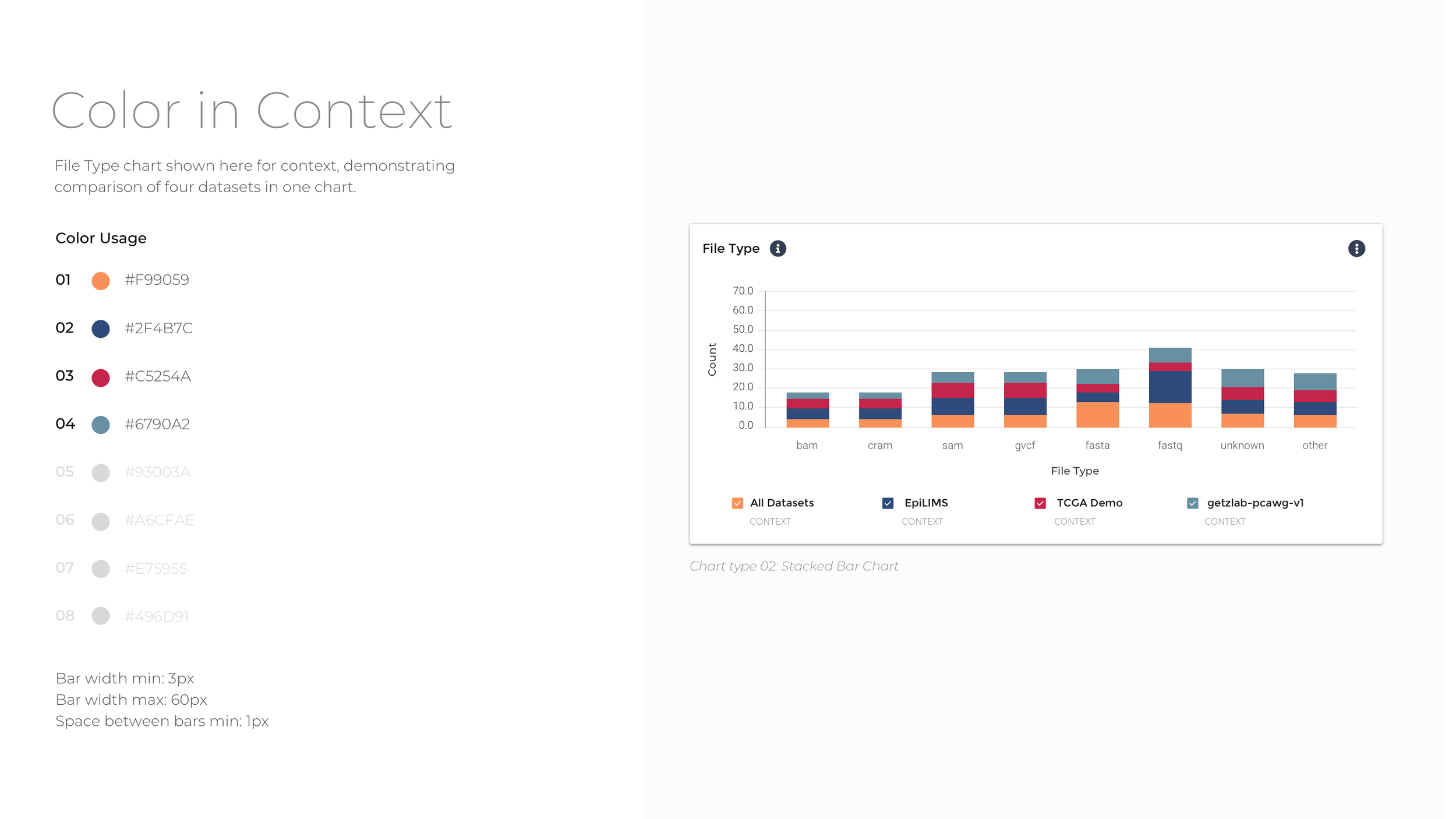
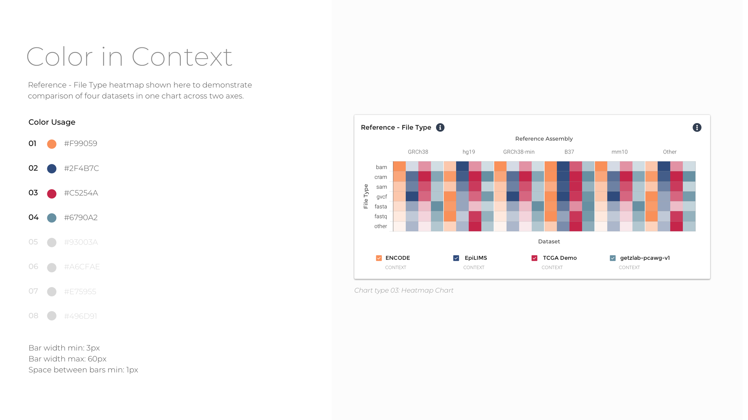
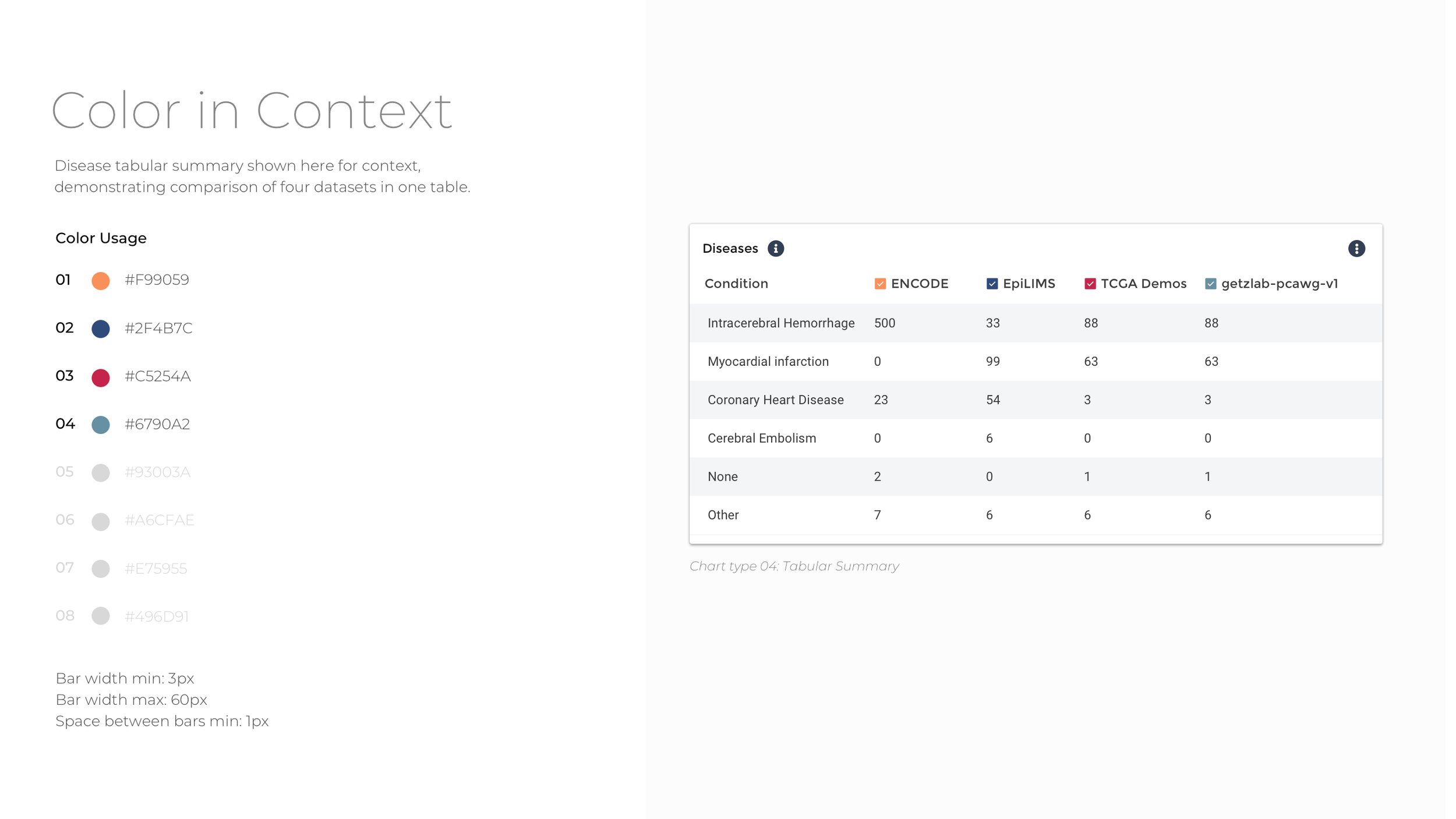
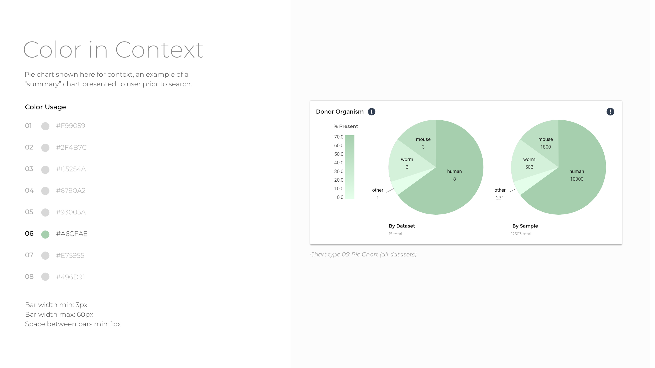
To reduce data density and group data tiles with comparative information, the experience is segmented into four categories: Donors, Biosamples, Activities, and Files. Within the four major datasets that comprise Data Explorer, there is significant diversity with respect to donor, assay type, data modality, and file type. To ease comparison, the data are grouped by parent dataset, and bar charts, tables, and heat maps used to show which datasets contain more of a particular kind of data.
Visualization Functionality
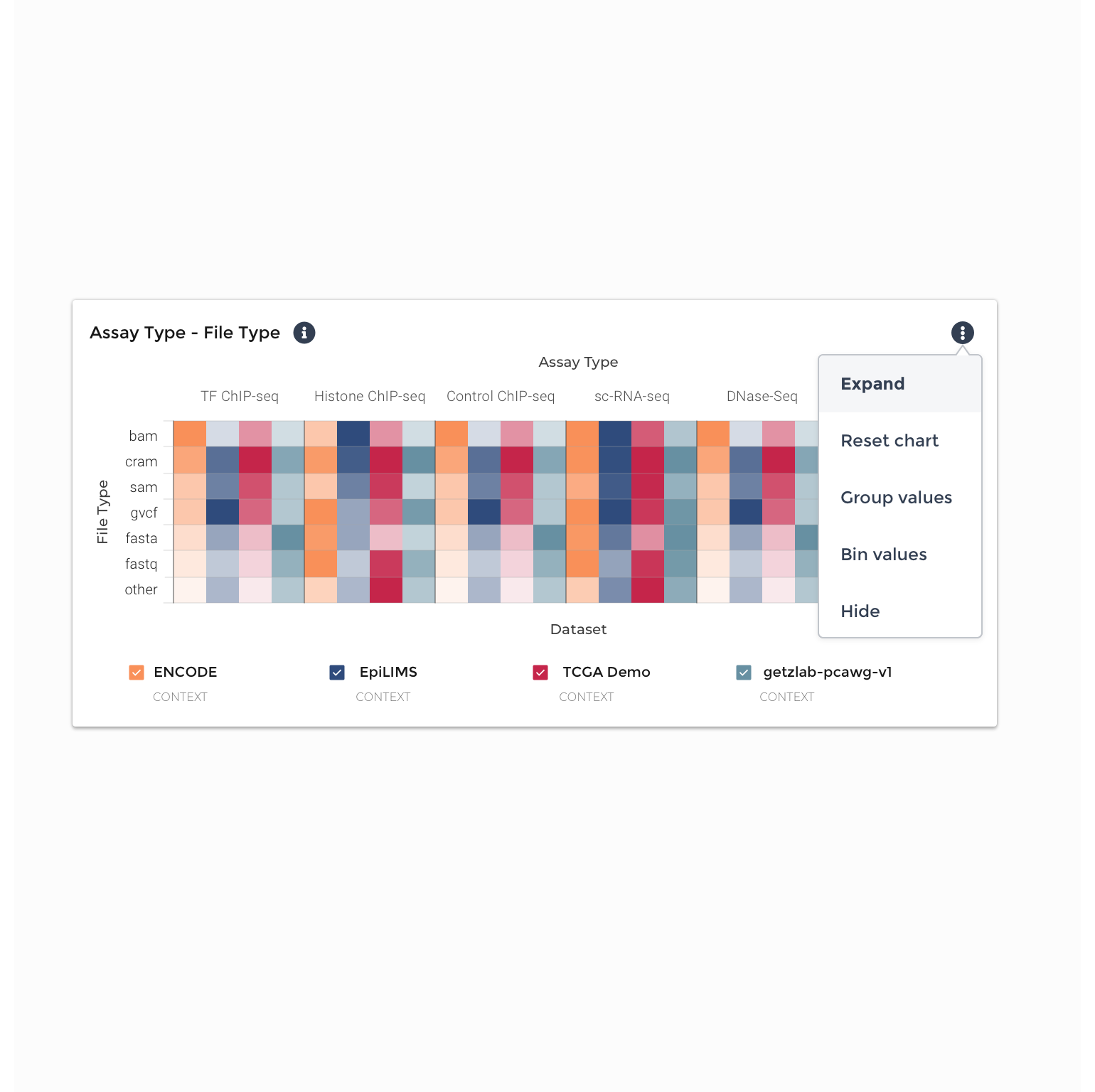
Next, I developed a set of consistent actions for each data tile. Consistency of interactions across tiles was prioritized for discoverability and ease of use. These actions include:
Expand: the ability to scale and expand individual tiles to fill the horizontal width of the page they are in, and then collapse or reset them
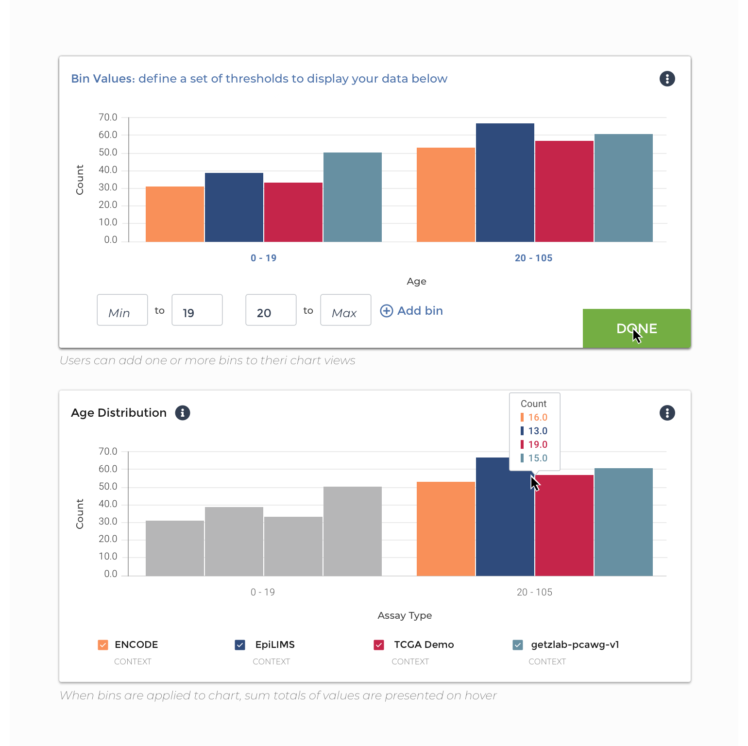
Threshold: the ability to bin, or threshold, the values within the chart they are viewing, without affecting the organization of the underlying data. On hover, a user would see the summed total of values within the bins they have defined.
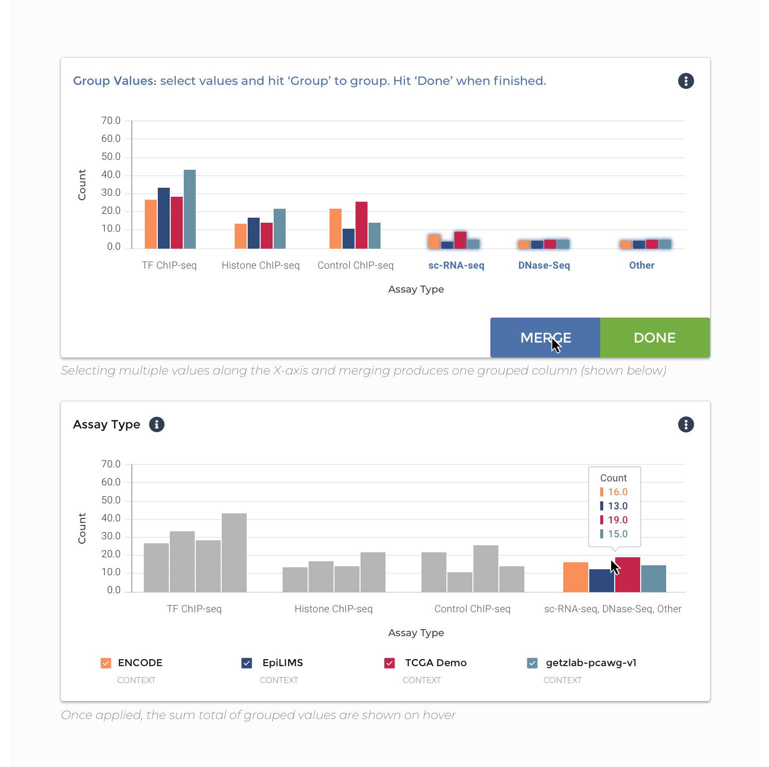
Group: the ability to group the values within the chart they are viewing, without affecting the organization of the underlying data. On hover, a user would see the summed total of values within the groups they have created.
New Tile: Via the “+” icon at the top right corner of visualization area, users should be able to add new tiles to their view. These ‘New Tile’ creation experiences would allow the user to define the chart type and data presented for a new visualization.
Color & Accessibility
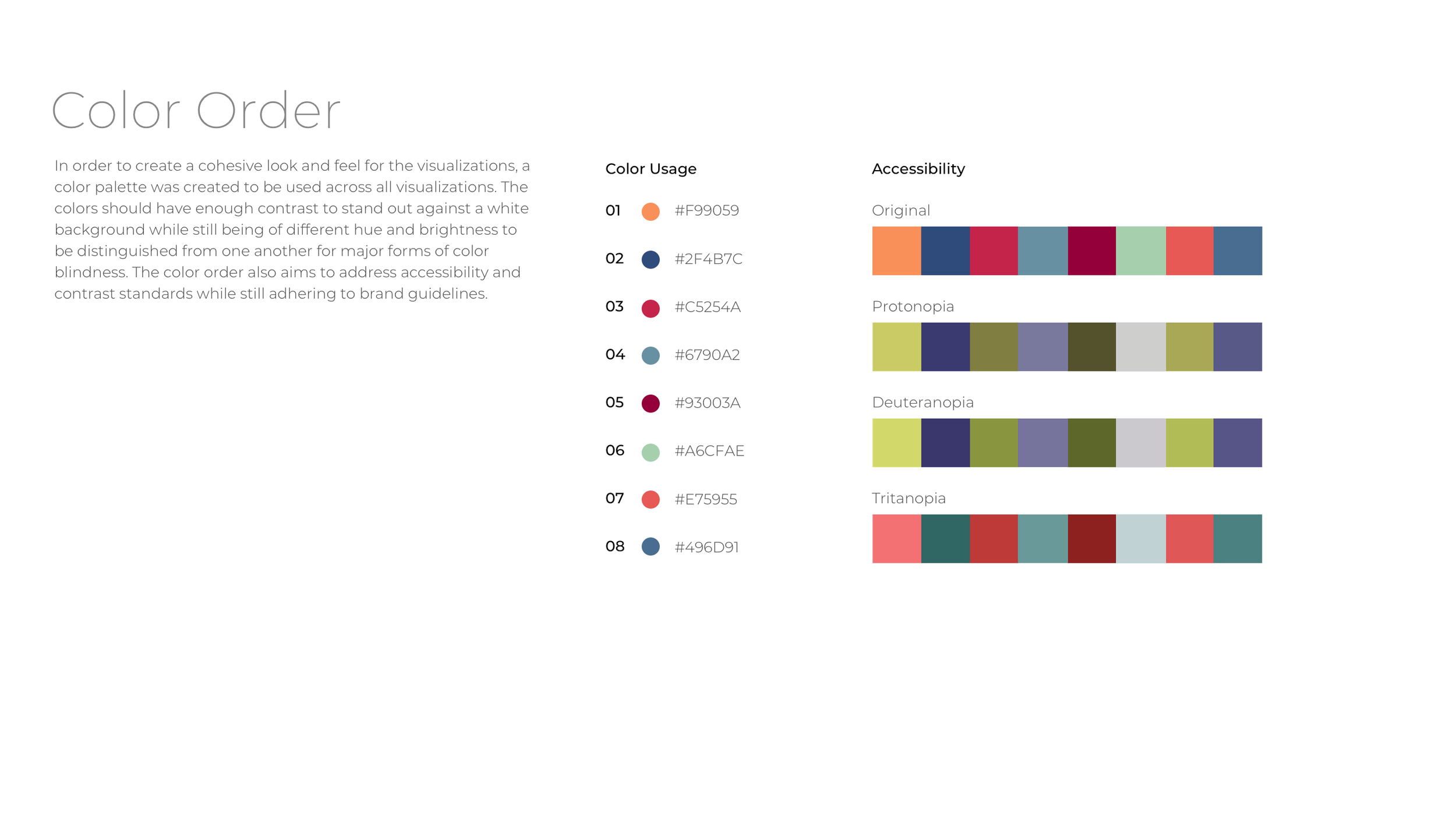
In order to create a cohesive look and feel for the visualizations, I developed an accessible color palette consistent with Broad Institute branding to be used across all visualizations. The colors have the contrast to stand out against a white background while still being of different hue and brightness to be distinguished from one another for major forms of color blindness. The color order also aims to address accessibility and contrast standards while still adhering to Broad DSP brand guidelines.
Delivery & Next Steps
A design specification document and a high fidelity interactive design prototype were created to demonstrate the interactions and functionality of the visualizations in context. These documents were handed off to the Data Science Platform product and development team at the end of my four-month consulting engagement. Next steps are ongoing and include additional evaluative user testing with a mixed cohort of PMs and computational biologists, integration into the final designs of the Data Explorer experience, development review and implementation.